Blessinger Design
The portfolio of Tara Blessinger
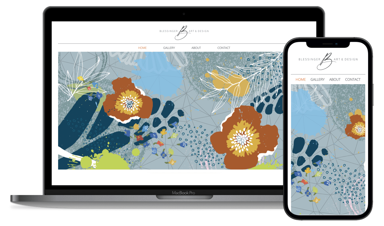
The portfolio of Tara Blessinger
Tara Blessinger needed an online portfolio. She has been a very successful designer, but once COVID-19 hit the world... people wanted to see her work online before they could hire her.
With me finishing my contract with Capital One, I had some time to finally help Tara out. So, I discussed with Tara the possibility of creating something from scratch. This would allow her to have a website that matches her personality and not have any limitations.
Tara got excited and started designing her portfolio in Illustrator. A week later, I received the entire designed website in Illustrator. Now it was time to bring her vision to life.
Tara asked me to create an advanced animated opening to her website. At first, I thought okay I am going to Anime.js to this intro. Yet, the deeper I have dived into Anime.js, the more I realized that it is manipulating CSS animations.
So, I ditched all the libraries and wrote the code from the ground up.
Breaking down an animation of this size I had to write out the timeline on my chalkboard. I decided to break it into 9 levels that would be loading on top of each. I wanted the animation to only last ten seconds.
To begin an animation, you need to think about the canvas. This canvas also needs to be on mobile devices. With that in mind I decided to create a height of 75vh (volumetric height).
Now instead of me breaking down each layer of code. Look at my code instead.
	  <div id="tara-animation-canvas">
		  <div id="ani-lev1__headlineText">DESIGNING UNIQUE<br>PERSONAL EXPERIENCES<br> THROUGH ART + SPACE</div>
		  <div id="ani-lev2__meshWires"></div>
	   <div id="ani-lev3__circles"></div>
	   <div id="ani-lev4__footsteps"></div>
	   <div id="ani-lev5__flowers"></div>
		  <div id="ani-lev6__topLeaf"></div>
		  <div id="ani-lev7__leftLeaf"></div>
		  <div id="ani-lev8__bottomFlower"></div>
		  <div id="ani-lev9__leftFlower"></div>
	  </div>
		/*==============================
		  Level One:
		  Keyframes canvas
		==============================*/
		#tara-animation-canvas {
		  z-index: 1;
		  background-color: #A6BAC2;
		  position: relative;
		  height: 75vh;
		  overflow: hidden;
		}

		/*==============================
		  Level One and Two:
		  Headline Text and Mesh Wires
		==============================*/
		#ani-lev1__headlineText {
		  z-index: 3;
		  position: absolute;
		  top: 50%;
		  left: 50%;
		  transform: translate(-50%, -50%);
		  color: #ffffff;
		  font-family: "Oxygen", sans-serif;
		  font-weight: 700;
		  font-size: 3rem;
		  letter-spacing: 1px;
		  text-align: center;
		  animation: opacityOff 8s normal forwards;
		}

		#ani-lev2__meshWires {
		  z-index: 2;
		  width: 100%;
		  height: 100%;
		  position: absolute;
		  background-image: url("../icons/opening-animation/tara-ani-lev-one.svg");
		  background-repeat: no-repeat;
		  background-position: center;
		  background-size: cover;
		  opacity: 0;
		  animation: wireMesh 4s normal forwards;
		  animation-delay: 2s;
		}

		/*==============================
		  Level Three:
		  Circles
		==============================*/
		#ani-lev3__circles {
		  z-index: 4;
		  width: 100%;
		  height: 100%;
		  position: absolute;
		  background-image: url("../icons/opening-animation/tara-ani-lev-two.svg");
		  background-repeat: no-repeat;
		  background-position: center;
		  background-size: cover;
		  opacity: 0;
		  animation: opacityOn 4s normal forwards;
		  animation-delay: 4s;
		}

		/*==============================
		  Level Four:
		  Footsteps
		==============================*/
		#ani-lev4__footsteps {
		  z-index: 5;
		  width: 100%;
		  height: 100%;
		  position: absolute;
		  background-image: url("../icons/opening-animation/tara-ani-lev-three.svg");
		  background-repeat: no-repeat;
		  background-position: center;
		  background-size: cover;
		  opacity: 0;
		  animation: opacityOn 4s normal forwards;
		  animation-delay: 6s;
		}

		/*==============================
		  Level Five:
		  Flowers
		==============================*/
		#ani-lev5__flowers {
		  z-index: 6;
		  width: 100%;
		  height: 100%;
		  position: absolute;
		  background-image: url("../icons/opening-animation/tara-ani-lev-four.svg");
		  background-repeat: no-repeat;
		  background-position: center;
		  background-size: cover;
		  opacity: 0;
		  animation: opacityOn 4s normal forwards;
		  animation-delay: 8s;
		}

		/*==============================
		  Level Six:
		  topLeaf
		==============================*/
		#ani-lev6__topLeaf {
		  z-index: 6;
		  width: 65%;
		  height: 65%;
		  position: absolute;
		  background-image: url("../icons/opening-animation/topLeaf.svg");
		  background-repeat: no-repeat;
		  animation: topLeaf 4s normal forwards;
		  animation-delay: 10s;
		  transform: translate(790px, -300px) rotate(33deg);
		}

		/*==============================
		  Level Seven:
		  topLeaf
		==============================*/
		#ani-lev7__leftLeaf {
		  z-index: 5;
		  width: 45%;
		  height: 45%;
		  position: absolute;
		  background-image: url("../icons/opening-animation/leftLeaf.svg");
		  background-repeat: no-repeat;
		  animation: leftLeaf 4s normal forwards;
		  animation-delay: 10s;
		  transform: translate(-400px, 0) rotate(33deg);
		}

		/*==============================
		  Level Eight:
		  bottomFlower
		==============================*/
		#ani-lev8__bottomFlower {
		  z-index: 7;
		  width: 55%;
		  height: 55%;
		  position: absolute;
		  background-image: url("../icons/opening-animation/bottomFlower.svg");
		  background-repeat: no-repeat;
		  animation: bottomFlower 4s normal forwards;
		  animation-delay: 9s;
		  transform: translate(850px, 900px) rotate(66deg);
		}

		/*==============================
		  Level Nine:
		  leftFlower
		==============================*/
		#ani-lev9__leftFlower {
		  z-index: 7;
		  width: 38%;
		  height: 38%;
		  position: absolute;
		  background-image: url("../icons/opening-animation/leftFlower.svg");
		  background-repeat: no-repeat;
		  animation: leftFlower 4s normal forwards;
		  animation-delay: 9s;
		  transform: translate(-660px, 640px) rotate(66deg);
		}

		/*==============================
		  Level Ten:
		  Keyframes animations
		==============================*/
		@keyframes opacityOff {
		  0% {
			opacity: 1;
		  }
		  25% {
			opacity: 0.75;
		  }
		  50% {
			opacity: 0.5;
		  }
		  75% {
			opacity: 0.25;
		  }
		  100% {
			opacity: 0;
		  }
		}
		@keyframes opacityOn {
		  0% {
			opacity: 0;
		  }
		  25% {
			opacity: 0.25;
		  }
		  50% {
			opacity: 0.5;
		  }
		  75% {
			opacity: 0.75;
		  }
		  100% {
			opacity: 1;
		  }
		}
		@keyframes wireMesh {
		  0% {
			opacity: 0;
		  }
		  100% {
			opacity: 0.3;
		  }
		}
		@keyframes bottomFlower {
		  0% {
			transform: translate(850px, 900px) rotate(66deg);
		  }
		  100% {
			transform: translate(850px, 300px) rotate(0deg);
		  }
		}
		@keyframes leftFlower {
		  0% {
			transform: translate(-660px, 640px) rotate(66deg);
		  }
		  100% {
			transform: translate(250px, 140px) rotate(0deg);
		  }
		}
		@keyframes leftLeaf {
		  0% {
			transform: translate(-400px, 0) rotate(33deg);
		  }
		  100% {
			transform: translate(-6px, -20px) rotate(0deg);
		  }
		}
		@keyframes topLeaf {
		  0% {
			transform: translate(790px, -300px) rotate(33deg);
		  }
		  100% {
			transform: translate(790px, -75px) rotate(0deg);
		  }
		}