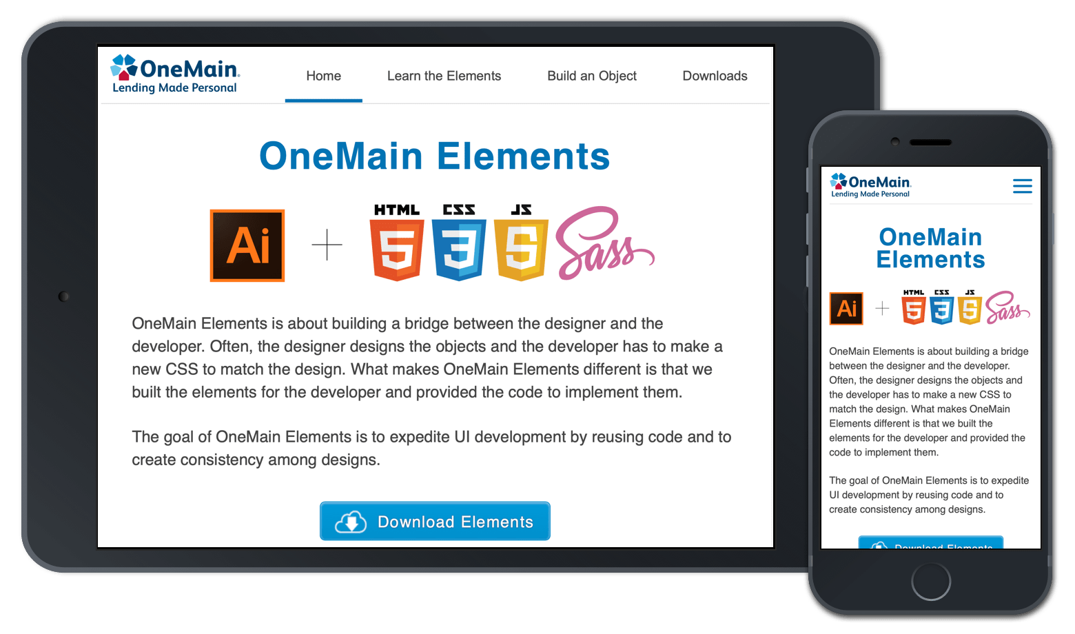
OneMain Elements
An interactive design system made exclusively for OneMain Financial
An interactive design system made exclusively for OneMain Financial
Every day my UX design partner and I would create Adobe Illustrator interfaces to get them approved by the shareholders. The next step in the process was to hand over the designs to the developers, and then we would move onto the next project to design. However, the problem began to arise.
When our designs got transformed into code, we saw a lot of things get lost in translation. What made matters worse is we discovered that a number of our Java Developers did not know CSS. So a lot of times, they would tell us that our designs were not possible.
As this cycle continued, we would see that many of our web applications lacked consistency, had multiple branding styles, and consisted of different sets of icons and frameworks such as Bootstrap or Foundation. Something needed to be done. It was not merely the typical "go make a style guide, and everyone will follow it" solution. No, we needed something bigger and more intuitive than that.
We began to layout the design template. The first design pattern we used was James Craig's readability rule for 45 to 85 characters per line. We built a container to hold all the writing content centered with a max width of 700 pixels.
From researching Nielsen and Norman's "Above the Fold" article, we knew we wanted to design something with the bulk of important content at the top of the first landing page. So our first two paragraphs of content were placed at the top of the page, and the download link for the framework was within the top fold.
We researched layout patterns and gleaned content from Nielsen and Norman's report on F-shaped viewing patterns. By placing the logo to the left and the navigation to the right with the content below, we could achieve a successful layout well within 700px container parameters.
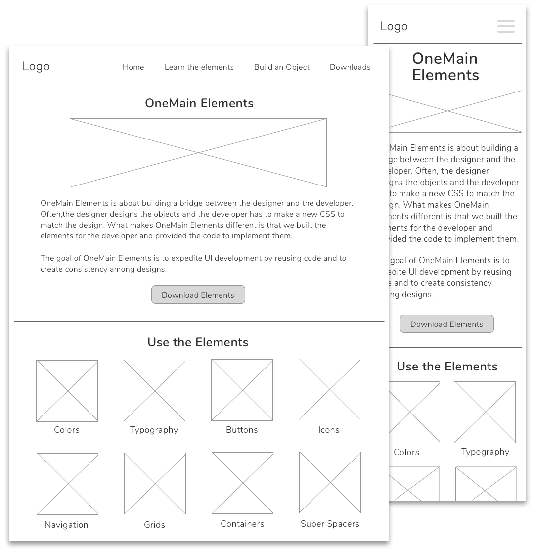
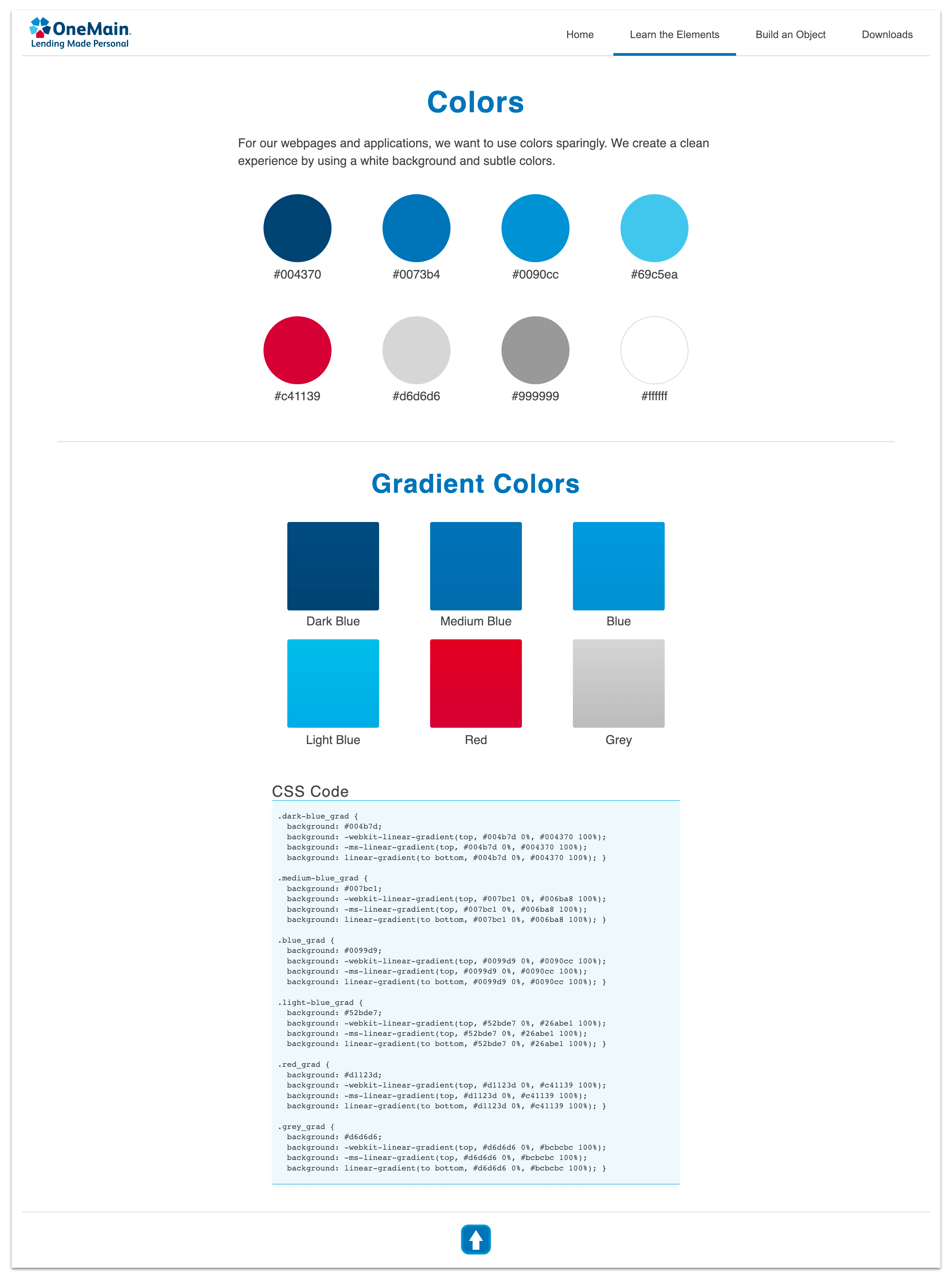
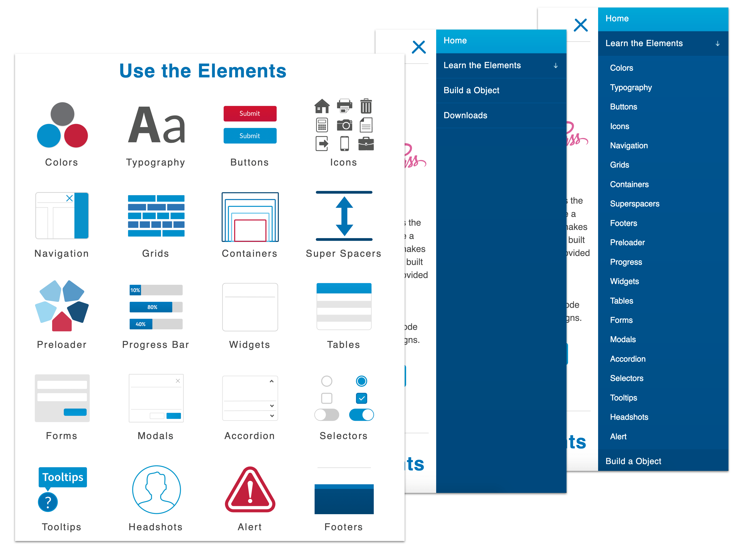
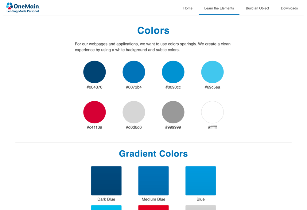
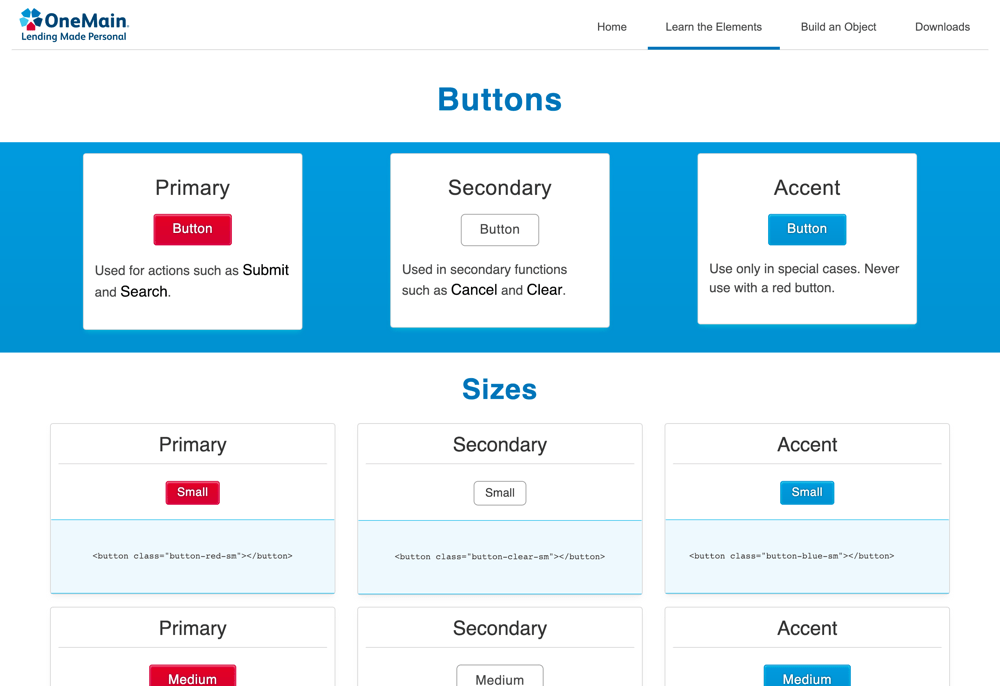
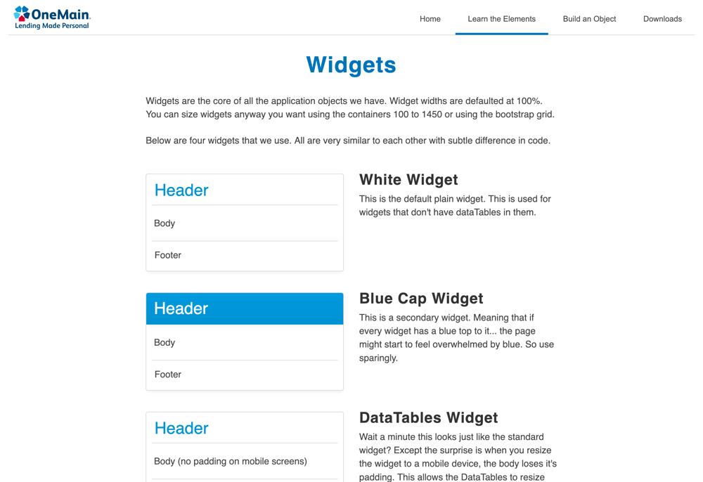
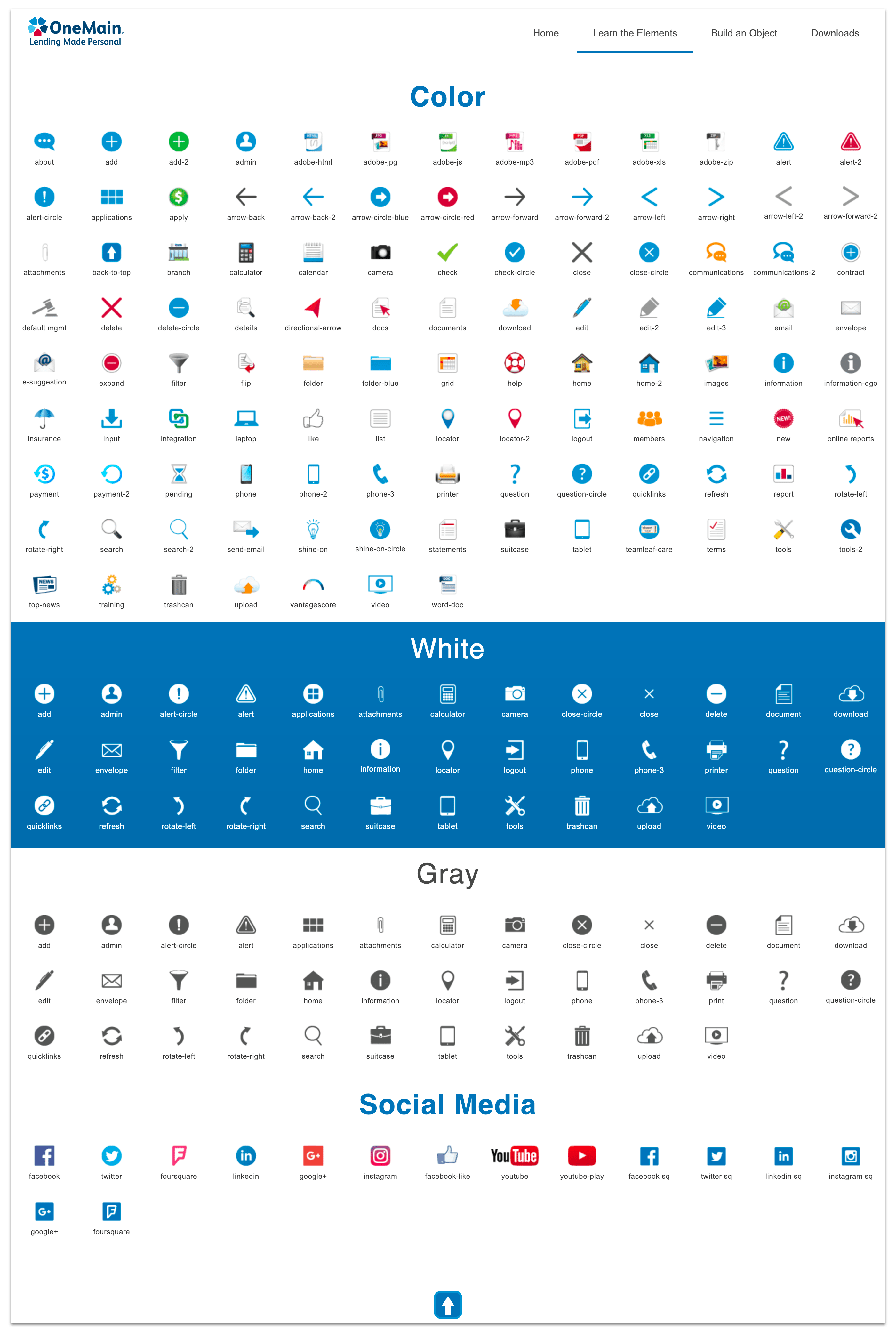
In the "Use the Elements" section, we used a clean white background and colorful icons with high contrast to attract attention to them.
When designing the mobile version's sidebar, we decided to use a monochromatic design technique of using multiple shades of blue to create a calming effect.
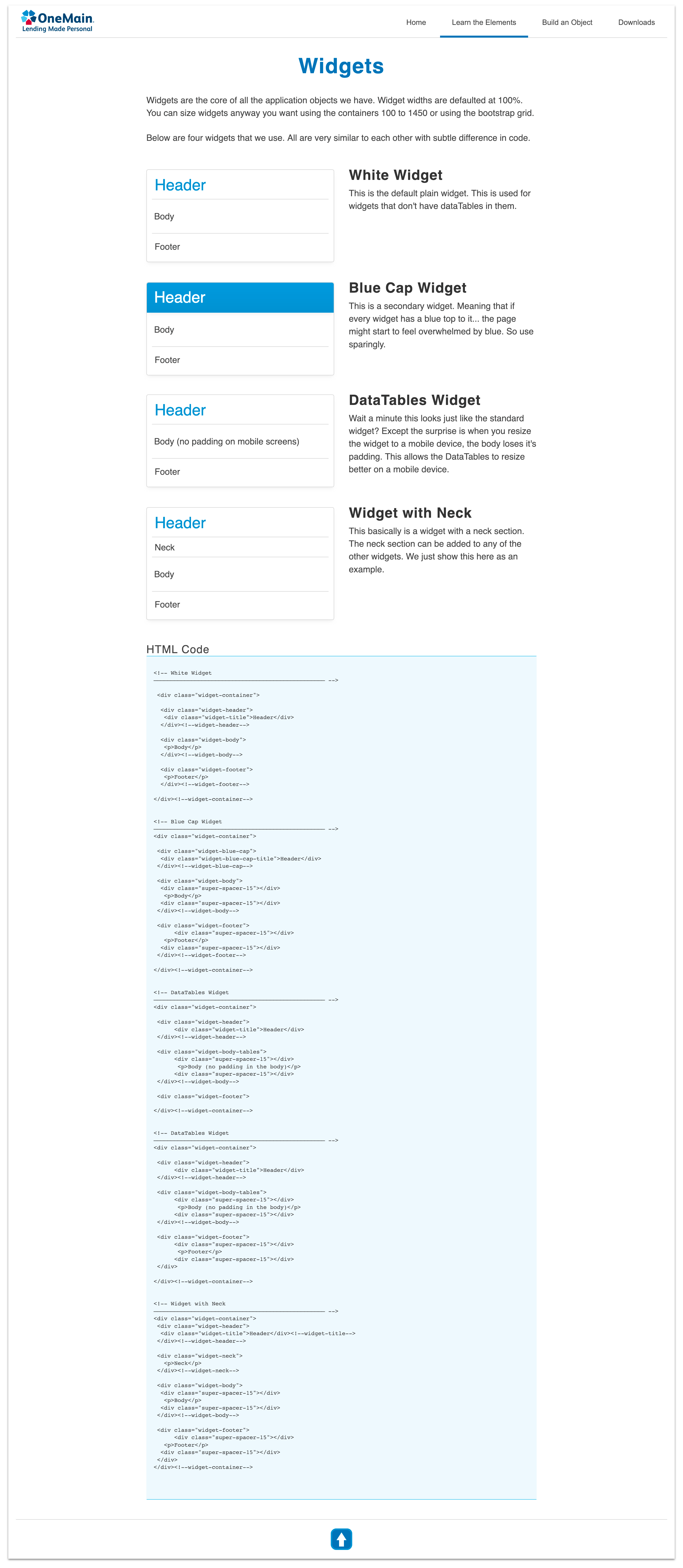
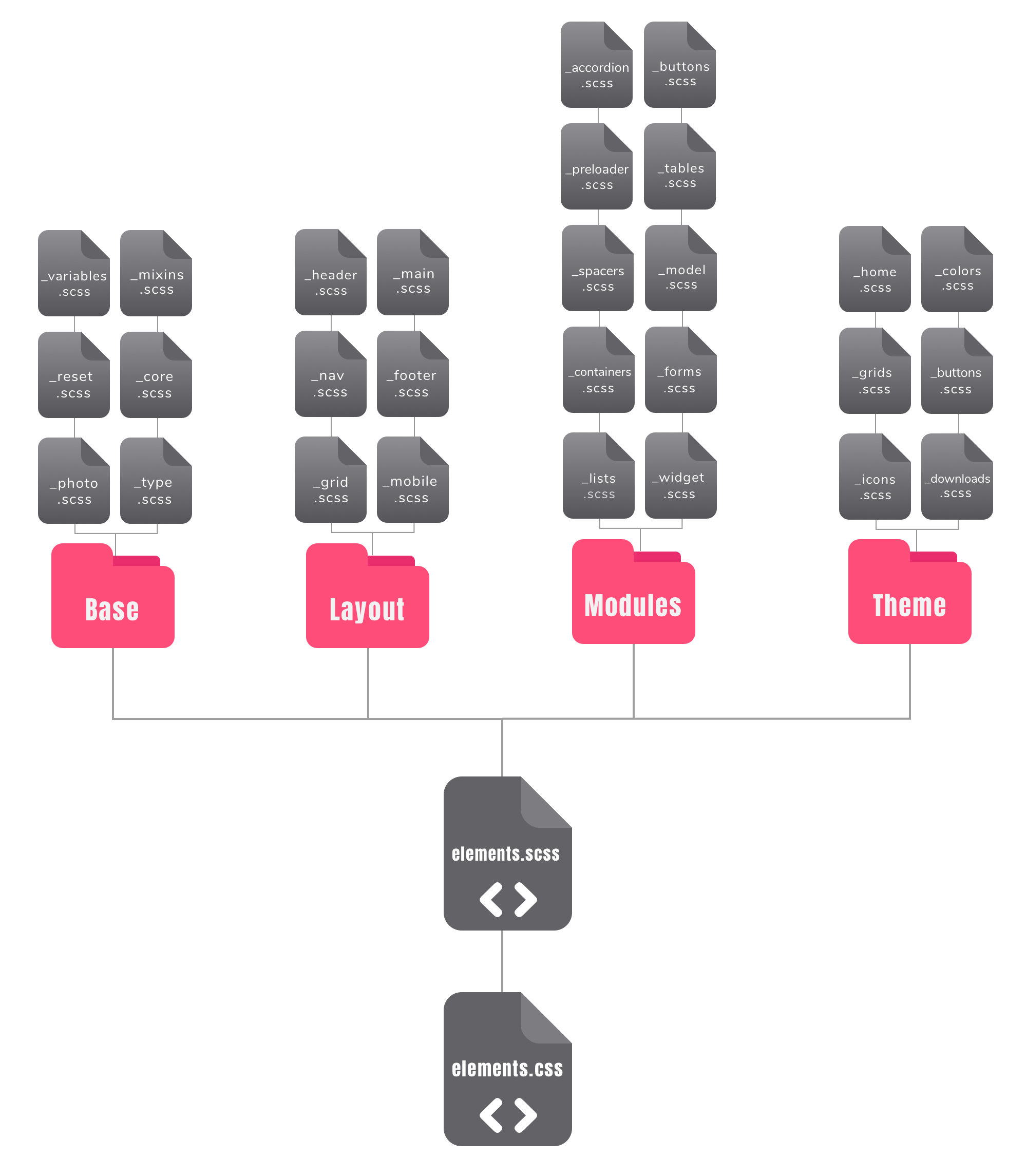
On our team, I was the one tasked with coding the framework. So at the time, SASS had just started to become popular. I decided to approach the project in terms of thinking of each element as a CSS module.
So, I started the project with Sass Mixins, variables, and a content organization approach inspired by SMACSS. This SMACSS approach broke down the SASS files' layout into partials in folders called the base, layout, modules, and theme. These elements were imported into one stylesheet.
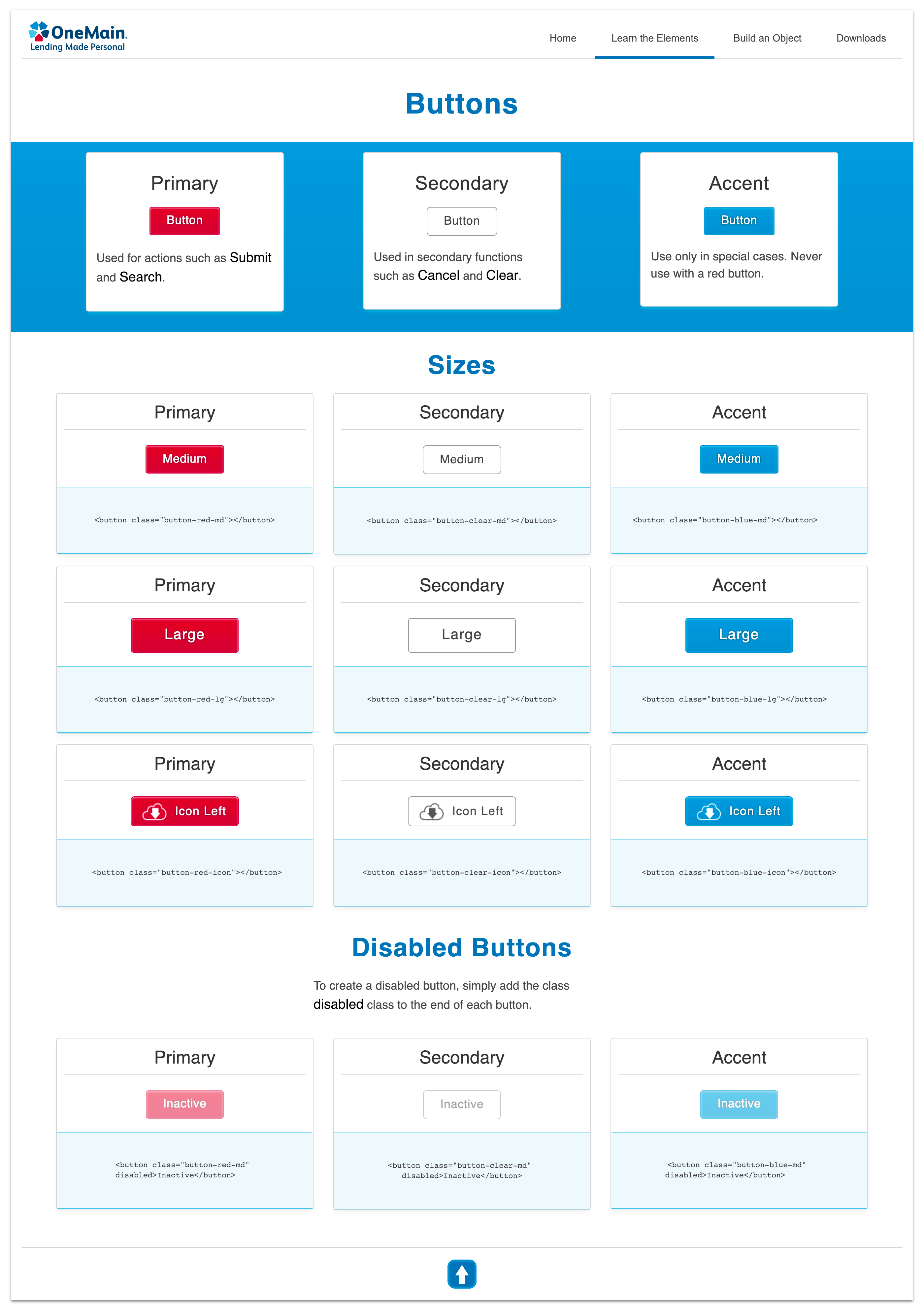
In every project I do, I look for a way to grow. I challenge myself to code the CSS dry without repeating anything. I use @extend to make sure each line of code is only written once. The result is a CSS framework stylesheet of 103kb.